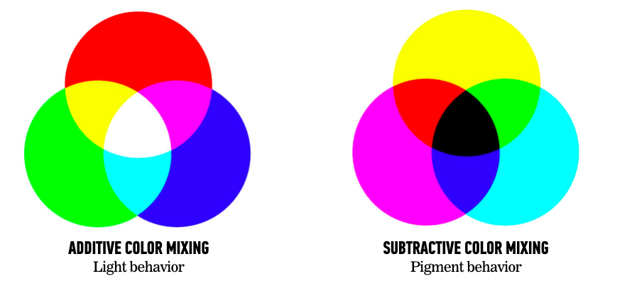
Additive vs subtractive color systems.
For most of my design career I had a pretty fuzzy understanding of additive and subtractive color systems. I knew enough to select RGB in my design programs for anything online, and CMYK for anything that was going to be printed. But why those two different color systems behaved so differently was a mystery. I blame my second-grade art teacher.
Most of us remember mixing paints together in primary school and learning that if you mix red with blue, you get a shade of purple, and if you mixed red with yellow you’d get a shade of green. We also learned that mixing all our paints together in a great big puddle in the middle of the art room made a muddy shade of brown and our teacher a shade of orange.
What we learned in second grade that passed for color theory is what is called a subtractive color system. In print design language, CMYK, which stands for Cyan, Magenta, Yellow and blacK, the primary colors of ink and the color you get if you mix them all together.
RGB vs CMYK
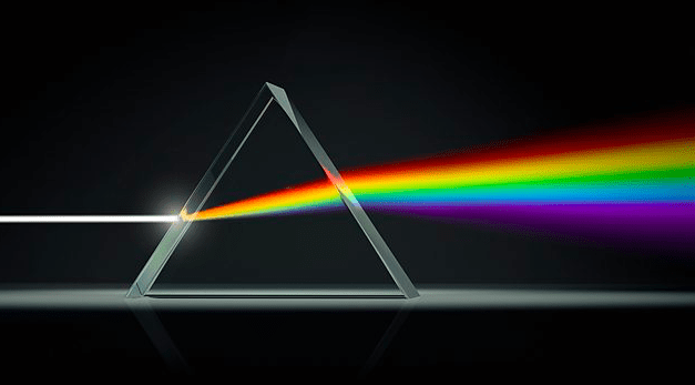
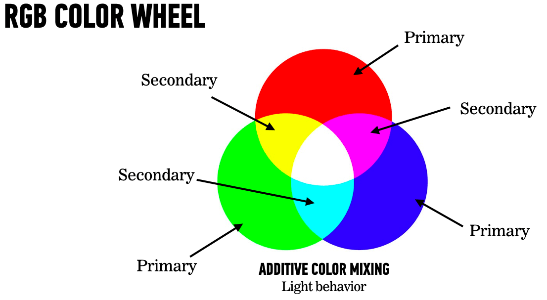
RGB stands for Red, Green and Blue, the primary colors in additive color system, and is based on how light behaves when it’s mixed together. Mix red and green light together and you get yellow. Mix green and blue light and get cyan. Mix all light together and you get white. Like looking at the reverse effect of sunlight through a prism.
When we’re designing for monitors–which use light to project the images onto the screen–we’re working in the RGB color system. But that doesn’t explain why color works differently in light waves than in pigments. It all seems such a mystery, until you know a little more about the physics of color.
Wavelengths and Eyeballs
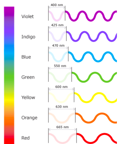
Light is made up of wavelengths. Photo receptors in the human eye are sensitive to short, medium and long wavelengths, which we perceive as a color: blue, green & red, plus all the colors in between.
Great, that (kinda) makes sense. But we don’t see colors in the light—unless it’s through a prism—we see them in objects. How does an object get its color?
Turns out, that’s light too. This is where the “additive” part of color systems comes in.
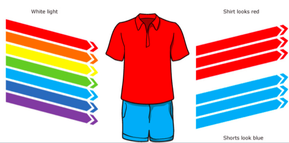
Why is my shirt red and my jeans blue?
Objects appear different colors because they absorb some wavelengths and reflect back to us others. When we see a red shirt, what we’re really seeing is what’s left after all the other lightwaves—blue, green, purple, yellow—have been absorbed by that shirt. Only the red isn’t absorbed, so our eyes see red.
Same thing with those blue jeans. All the red, green, yellow and magenta wavelengths were absorbed, and only the cyan bounced back for us to see.
But wait–you’re asking–magenta and cyan, aren’t those part of CMYK? How did they get into our RGB colors? Turns out, cyan, magenta and yellow are the secondary colors of RGB. Does your head hurt yet?
Check out the color wheel below. Red, green and blue are the primary colors, while cyan, yellow and magenta are the colors you get when you mix two of those lightwaves together in equal parts. There are some fun Youtube videos where physicists with red, green and blue flashlights show this mixing together. Go look at them!
Hue, saturation and brightness (HSB)
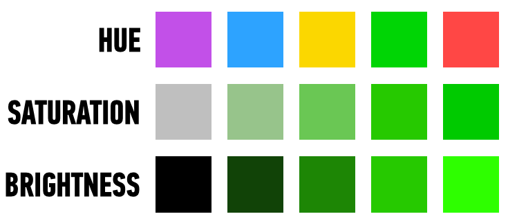
There are a couple of other ways you can mix light to make colors. If you’ve ever played around with the HSB settings on your Sketch color palette, you’ve seen how to make colors blacker, more pastel, and more vivid using combinations of hue, saturation and brightness.
Hue. Remember the lightwaves? Some area really long, some are really short, some in between. Those are all the hues—also known as color.
Saturation. The best way to understand how saturation works is to play around with a flashlight on a piece of paper. If you were really into this, you’d get yourself a red, green and blue light flashlight. But just an ordinary white light beam will work. Shine the light on a piece of paper. Notice how the spotlight on the paper gets stronger and more focused as you move the flashlight toward the paper, and weaker and more diffused as you move it away from the paper? That’s what saturation does.
The more intense colors are a more focused beam of light—like a flashlight close to the paper. The less intense, the more diffused the light—light a flashlight shining from across the room.
Brightness. Now turn off all the lights so you’re in a dark room with only a flashlight. As the batteries on your flashlight fade, so does the beam of light, getting slowly darker and darker. That is the effect of the brightness levels—how much light is mixed with absence of light (darkness).
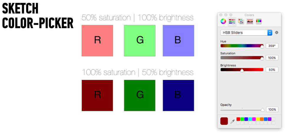
The Sketch color selector with varying HSB values for red, green and blue.
You can see it in action in the screenshot above. Notice what happens to our primary colors when the saturation is reduced, or when the brightness is reduced. Red becomes a pastel pink with full brightness but 50% saturation; and a brick red with full saturation but 50% of brightness.
Translate that into HTML
When it comes to using colors in online applications, things begin to get complicated. Since I’m a designer, I am going to avoid math wherever possible to explain how your browser know what color to display to the user when it reads the CSS and HTML.
To denote colors in a website, we have to turn a perceptual lightwave HSB into a value that can be displayed online consistently for every viewer, on every kind of hardware. This is hard to do! It used to be even harder.
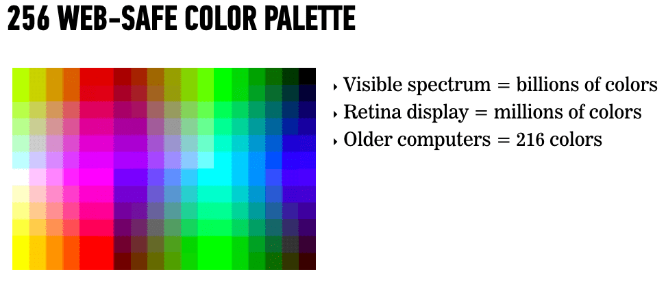
Back in the early days of color monitors, designers could only chose from those web-safe colors when selecting a palette, because monitors only displayed 216 colors.
A pixel on a screen is made by combining saturation and brightness of various hues, usually with 8 bits (256 values) for each. In HTML, these values are given a number on a scale of 0-255, where 255 represents full intensity for that hue and 0 represents no intensity (so, no color).
You can see this in action on your color pickers in any design application, and in the graph below, where red is given the decimal number of 255 (and green 0 and blue 0). In the corresponding color picker, you can see how that decimal is translated into the hexadecimal value that goes into the CSS and HTML. (Designers like to sound smart by referring to this as the “hex number.”)
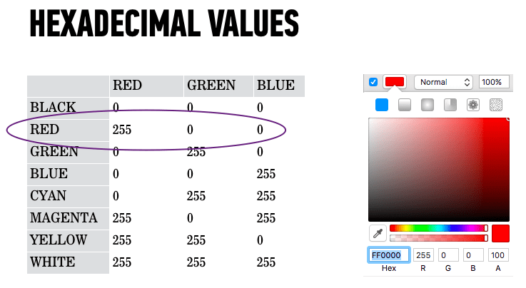
Above is the table with decimal values for each primary and secondary color. Next to it is the Sketch color picker showing the same values for the color red: 255. The picker also handily translates that into the hexadecimal value of FF0000, which goes into the CSS or HTML.
Designers were once restricted to “web-safe” colors to ensure that the colors they selected were the colors every user saw on all those crappy monitors. Today, displays can show millions of colors—which is still less than the billions of colors the human eye sees in the real world. We’ve still got a long way to go.
Today, most shades a designer wants to use can be converted into a hexadecimal number and included in the CSS of a webpage.