“People decide whether or not they like a product in 90 seconds or less. 90% of that decision is based solely on color.” – 99designs
Color Psychology
Color psychology is the idea that colors elicit emotions from people, often subconsciously. Color has a predictable and quantifiable physiological effect that influences our perception and our behavior. It is about emotions, and whether people know it or not (or admit it or not) the colors used in a design strongly affect those emotions.
So blue might convey a feeling of trust, calm, masculinity, while yellow makes you think of creativity, summer, positivity.

Color is subjective
Now that we’ve sorted that all out, it will be easy to pick the perfect color palette for your brand or business or product, right? Just choose from the color families above and start mixing.
Blue is for boys, pink is for girls, and white signifies purity. Everybody knows that.
But wait—be careful!
Not all colors mean the same thing in all contexts, or all cultures.
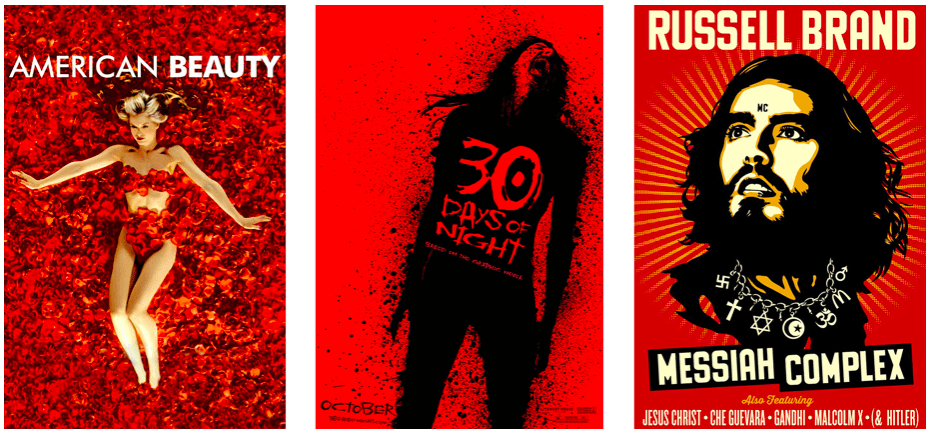
Color is contextual
The meanings of colors are contextual, as the image above demonstrates. Red can be the color of love and valentines, or of serial killers and cult leaders. Depending on how you use the color, or to what metaphors you apply it, red can be fast like a race car or cool as an icy cold Coke or dead as a zombie.
Brides wear red, white means mourning, and green is for someone who cheats or is a cuckold. That’s right, color theory is different in different cultures.
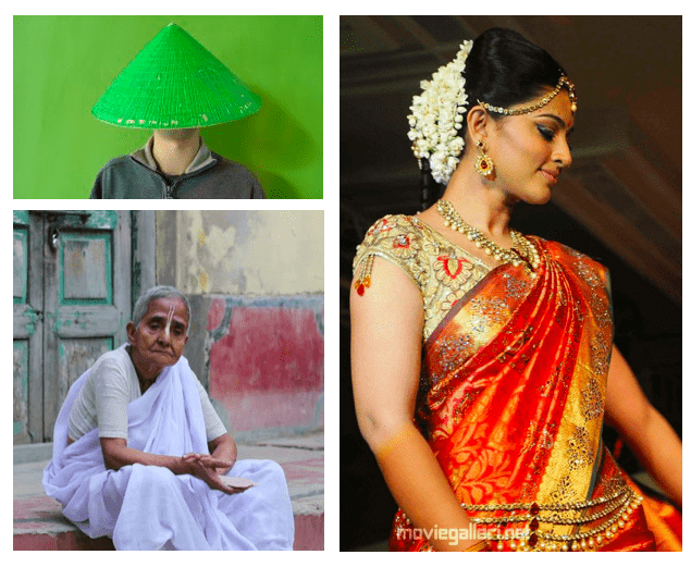
Color is cultural
Colors are culturally created; in America, the color white means purity, chastity, and virtue, and so is the color of a wedding gown. In India, widows wear white saris and brides wear red. We see green and think of the great outdoors, the Chinese think of sickness, or cheaters.
How you use a color—what palettes you put together—must be thought through carefully, and with sensitivity to the culture in which that brand or product will be displayed.
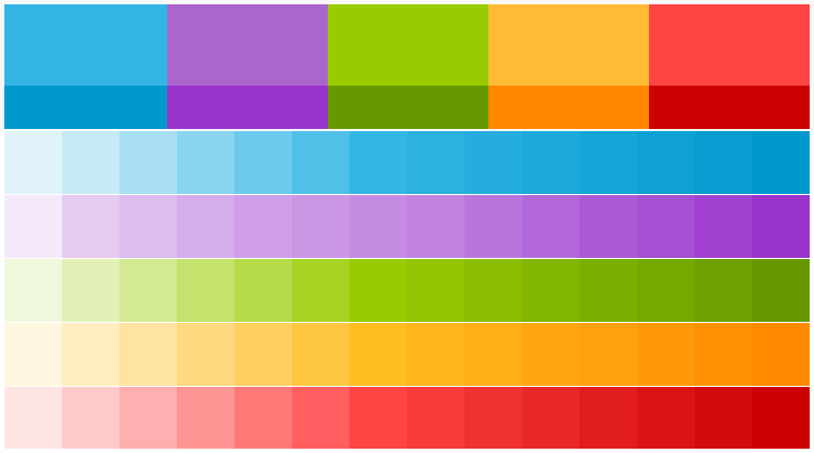
Ways to build and test a palette
While the psychology of color may help to explain why someone feels a certain way about a certain color, it isn’t the only determining factor in selecting your color palette. The entire design, from UX to UI to branding and logo all work together with color to convey a subconscious message to your customers. What emotions do you want your brand to promote or project?
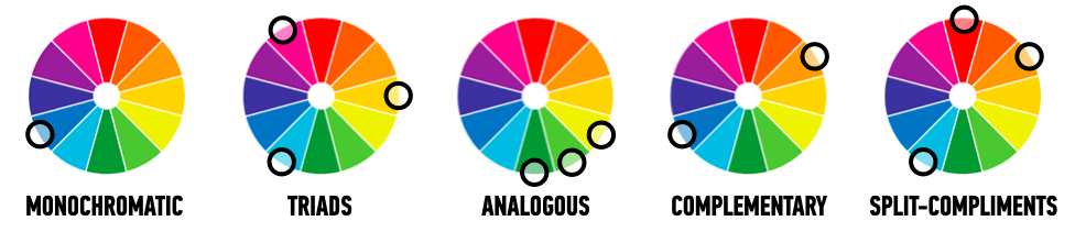
Not so fast. There’s a lot more that goes into picking colors for your product than just understanding RGB and HSB. There are whole schools of thought around how to build a color palette and some fantastic tools. Some say only have three colors, or four, or five. Others say you need a neutral, a bright and a dark. Still others caution you always to stay with the same SB values but select different hues. Some advocate for all one hue and vary the saturation and brightness…
What to do, what to do? The answer is: it depends.
It depends on your product, the emotional response you’re hoping to evoke, the color trends of the year (or season, or moment) and cultural aesthetics and values.