Let’s Lunch is an uber-cool startup here in San Francisco (and New York, and just opened in Spain) that matches professionals for lunch dates. I love the concept and I’ve been on a bunch of great lunches with investment bankers, engineers, other entrepreneurs and people that I’d like to meet but don’t ever seem to bump into. It’s an excellent service.
Unfortunately, its website is not a great user experience.

Let’s Lunch — If You Can
Let’s look at the brilliant concept but hard to use mobile website for Let’s Lunch. I love this start-up. I’ve had a bunch of fun, informative lunches using their social platform, and they’re growing like crazy. I met the founder, Syed Shuttari once, and he’s super cool too. So I wish them the best. However, as a user, I find their mobile site problematic. The main problem being that they don’t really have a mobile site. Their website is not responsive, and so here’s what it looks like on my phone:
Yes, You Must Have a Responsive Website
Ouch. Pretty much unreadable. Now, maybe they have an App, but they don’t alert me to the fact when I arrive at their website, and I’ve been too lazy to look. (Oh, you think Users aren’t lazy?)
Even if there is an app, the website still has to be responsive to the mobile device because a good chunk of your users will come into your business that way, and most of your new users will find you through your website first.
Pyramid Approach to Information Architecture

Good Information Architecture (IA) ensures that the functions of your app are neatly organized and easily found. Good IA is akin to a good filing system or a well organized term paper. It starts with the main point and works down to the details. (Or, using the filing cabinet metaphor, it starts with three main drawers, inside each draw are well labeled folders in some rational order, and inside each folder are all the individual documents.)
For a more 3D example, think of a pyramid.
The top of the pyramid is the doorway into your app. Imagine a little door at the very top of the pyramid, and that’s how every most users get into your mobile application, through the one or two main things they want to do. One door, leads to a slightly bigger “room” with a few more doors, which lead to more rooms and doors as you work your way down the pyramid.
The thing the Users want to do could be see who invited them to lunch, or check out that cool jacket they saw in the ad, or find the perfect condo, at the perfect price, or a nearly infinite number of things.
What the User wants to do is different for every app. But for each app there is a single, primary activity that is the goal of our users. Your job, should you choose to accept this assignment, is to figure out what it is and make sure they can do it. Easily.
What’s the Top of Your Pyramid?
Aside from not using basic -webkit- markup with their website so the fonts are large enough to read, Let’s Lunch has a more fundamental problem. They don’t know the one main thing their users want to do when they get to the site. This is a fairly typical IA problem.
For some, figuring out the Primary Use Case can be hard. But this is a lunching website, so by definition the main use case will be people scheduling lunches and then going to lunches. So for everyone but the first time user, trying to find out who and where they’re meeting as they’re on the way to lunch is their main mobile goal.
Guys, you’ve gotta get mobile right.
Everything and the Kitchen Sink
Here’s an example of being fuzzy about what users want to do on the site. The main page after you’ve logged in is a mish-mash of everything any engineer could think a user might want to do, and quite a few things the BizDev guys wish the user would do. But this just won’t do.

Oh Noes! 17 Upcoming Lunches?
What I want to do is see if I have any lunches this week, and if not, see if I can schedule them. This is the main goal most of us will come to the site for. So it’s good that at the top of the screen there is a category for Upcoming Lunches. But according to this I have 17 upcoming lunches!
Right off the bat that freaks me out, because if I’ve somehow scheduled lunches with people, I want to be sure I show up to them. This is a networking site, and I definitely don’t want to be the person that stands people up.
But wait, on closer examination, those 17 lunches apparently include all the lunches I’ve already been on. So, not really upcoming lunches at all. Because there’s no year indicated it takes me a little while to realize many of those are lunches from last year, not this year. Some are as old as 12 months!
Scheduling Lunches
Then I see a list of people “Available for Lunch.” What does that mean? Are these people that want to have lunch with me? Are they people that, via some unknown algorithm, have been chosen as likely lunch partners for me? Or are these just random people in my neighborhood who are available for lunch? It’s a mystery, and that means I’m not sure the correct etiquette for interacting with them. That’s not good on a social site, since users will rather leave than make a social faux pas.
Looking over at the left hand nav, I see that I have three invitations to lunch. Again, a flutter of anxiety. Who for lunch? When is lunch? How come I don’t know about this, shouldn’t I have gotten an email if someone invited me to lunch? It’s never a good idea to scare your users.
Flash forward to 20 min before my scheduled lunch date. I’m in the car, looking for the name of the restaurant so I can get driving directions. For some reason adding it to my calendar from the website didn’t add it to my calendar. I don’t see the info I need on the home screen, so I take a stab and tap the “See all upcoming lunches” link.
Yikes. And then there’s this. . .

Solving the Mystery
Social sites should be very clear and transparent about how they work. Users need to fully understand the system, from beginning to end, before they will risk getting involved in your group.
For this social system, I want to know this:
- I want to see who I’m having lunch with, in chronological order, on the first page.
- That should include my lunch date’s name, the time, date (including year) and the restaurant.
- And a map to the restaurant.
Everything else can be behind a button (secondary and tertiary levels), but this information, which I will need frequently and at my fingertips as I’m heading to the lunch, it should be front and center.
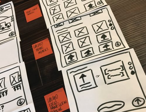
The Redesign
Here’s a fully responsive design for the home page that won’t drive mobile users insane:

Of course, these aren’t the only UX changes I would recommend. I’d actually love to see Let’s Lunch reconsideration the entire architecture of this site. It could be so much simpler. Elegant. Easy to use. But starting with this would be a BIG improvement.