Project Description
Slyde Mobile Payments

Client: SK Planet America
Team: Susan K Rits, Head of UX; Jade Liang, UX/UI design; Grace Jungok Cho, UX design
Time to launch: 1.5 months
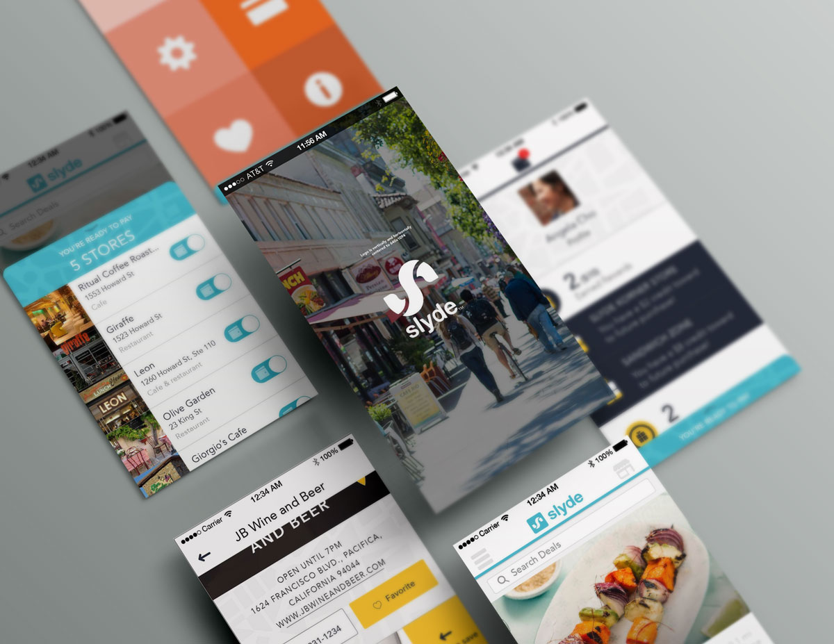
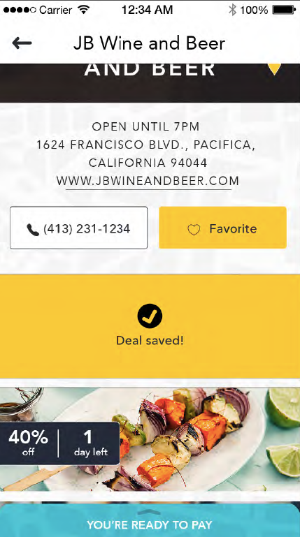
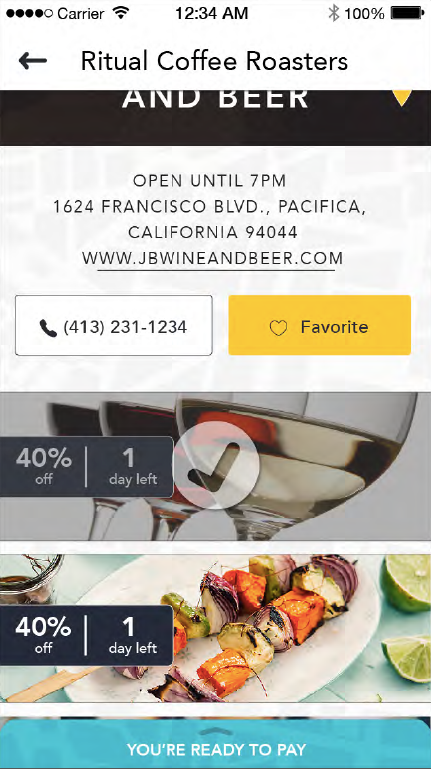
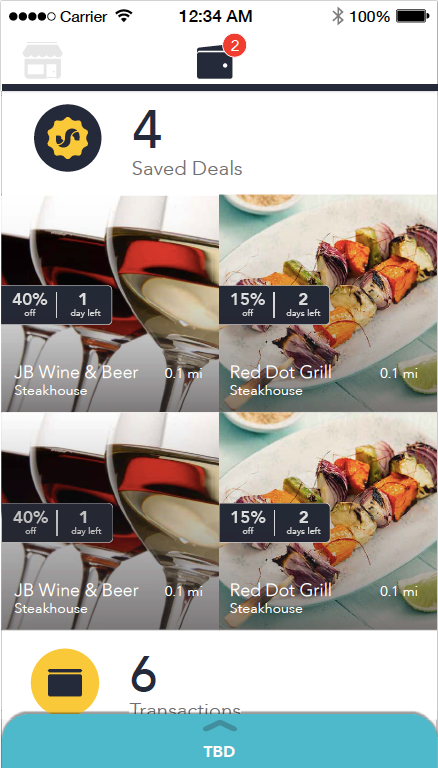
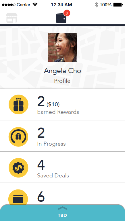
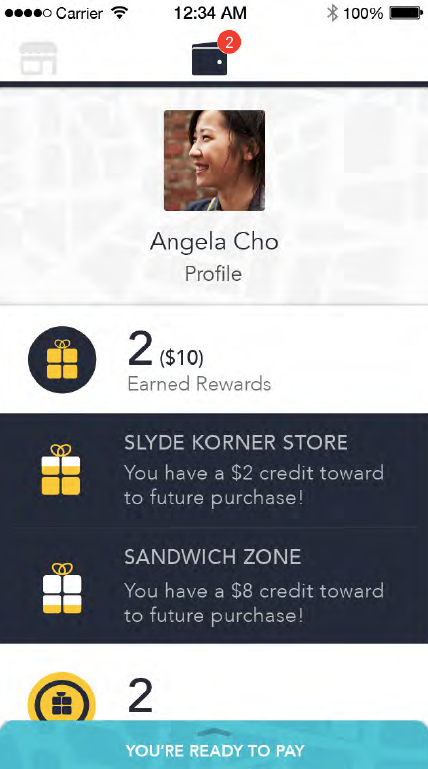
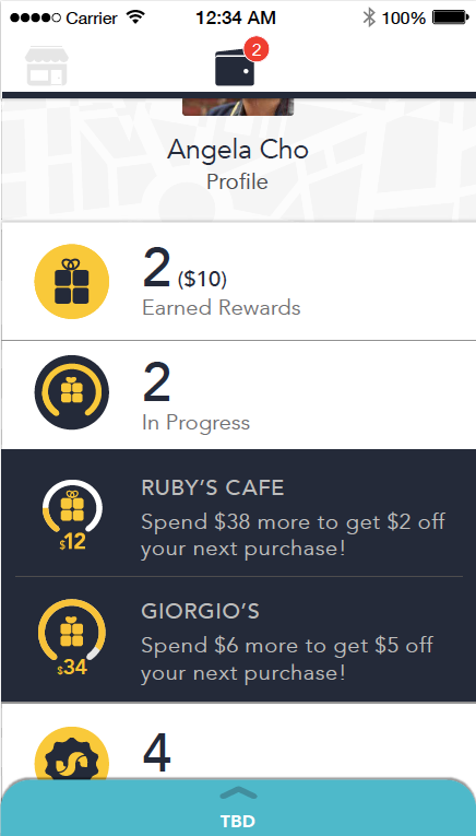
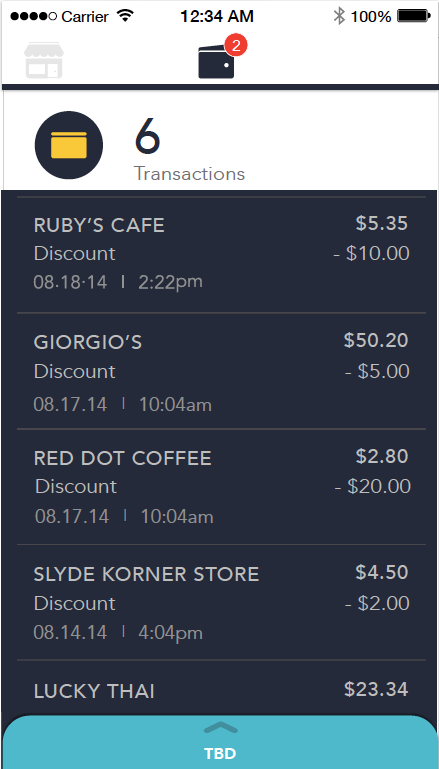
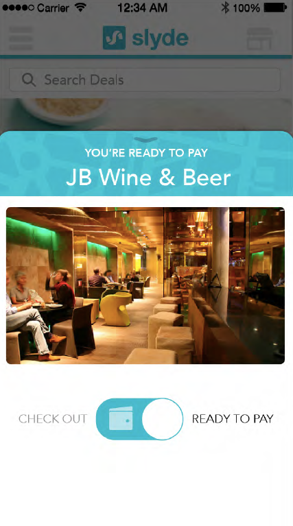
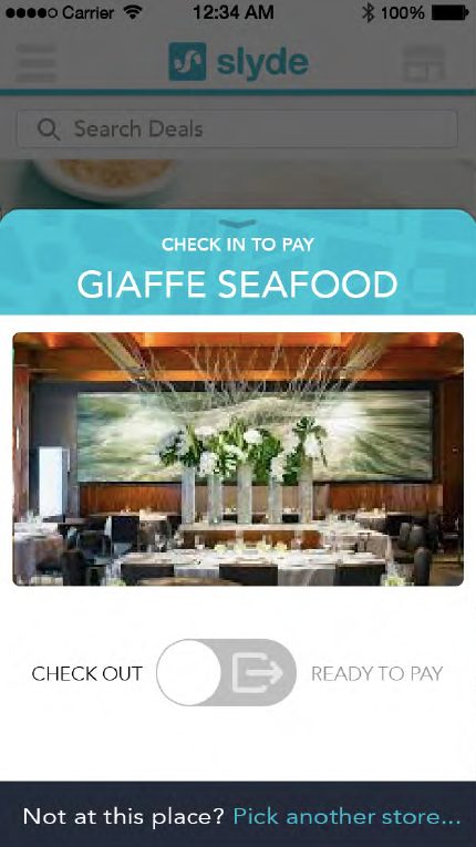
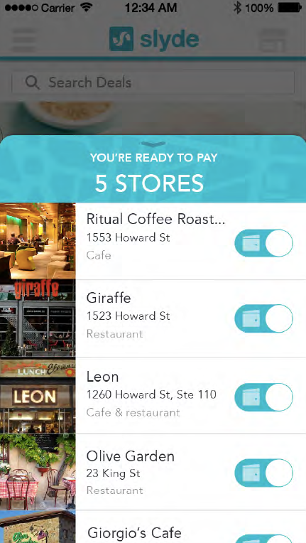
At SKPlanet, our team designed and built the first mobile payments app in the US. Using iBeacons and proprietary mobile payments technology, Slyde lets you walk into a store, make a purchase and walk back out without ever taking your wallet or your smartphone out of your pocket.
Our intuitive UX was easy to use, our gorgeous UI delighted users bringing them back again and again.
Challenges
Aside from multiple cutting-edge technology challenges (iBeacons, mobile transactions, POS) the customer experience design was a big issue. Our existing mental models for making an in-person purchase did not yet include walking into a store, grabbing a basketful of goods and walking out without talking to a clerk.
Yet, that was the transactional model we were beta testing.
Pain points included:
Solutions
We conducted design ethnographies to understand how small business work-flow happened so that we could build a service and UI experience that worked with that model as much as possible.
Intuitive User Interface
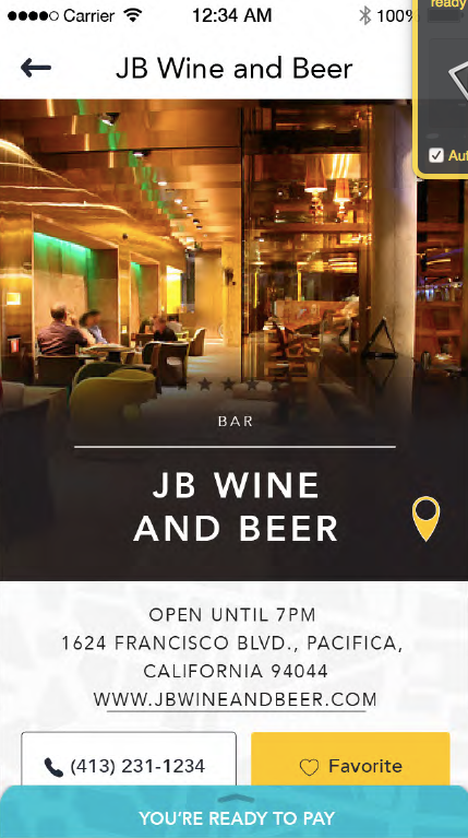
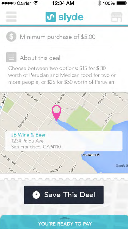
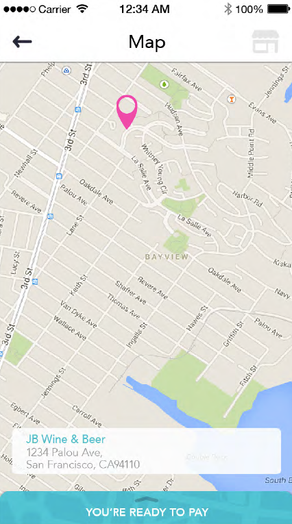
With mobile especially, the user experience must be simple and intuitive. No time to watch a demo or search the Q&A. Our designs are easy to understand the very first time a user sees them. And they’re delightful to use, so customers return again and again.
Excellent Results
Our designers are masters of visual communication and information architecture. Which means the work they produce is fantastic too.


