Client: Sephora
Role: Sr Director of UX
Size: 2 Designers/ 2 PMs
Duration: 4 months
The Problem
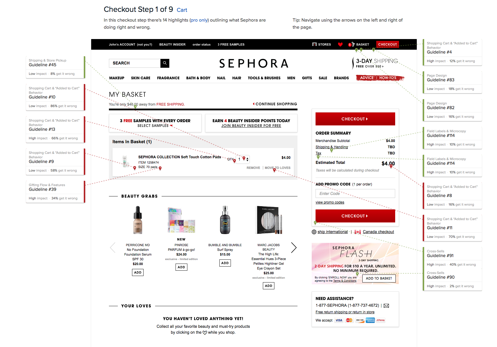
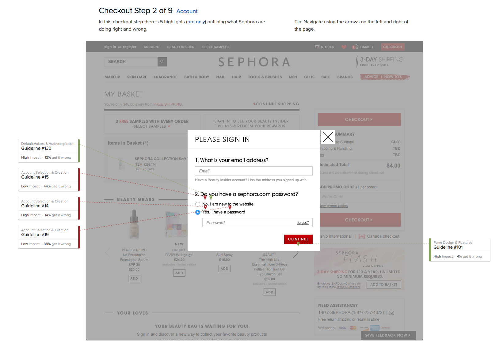
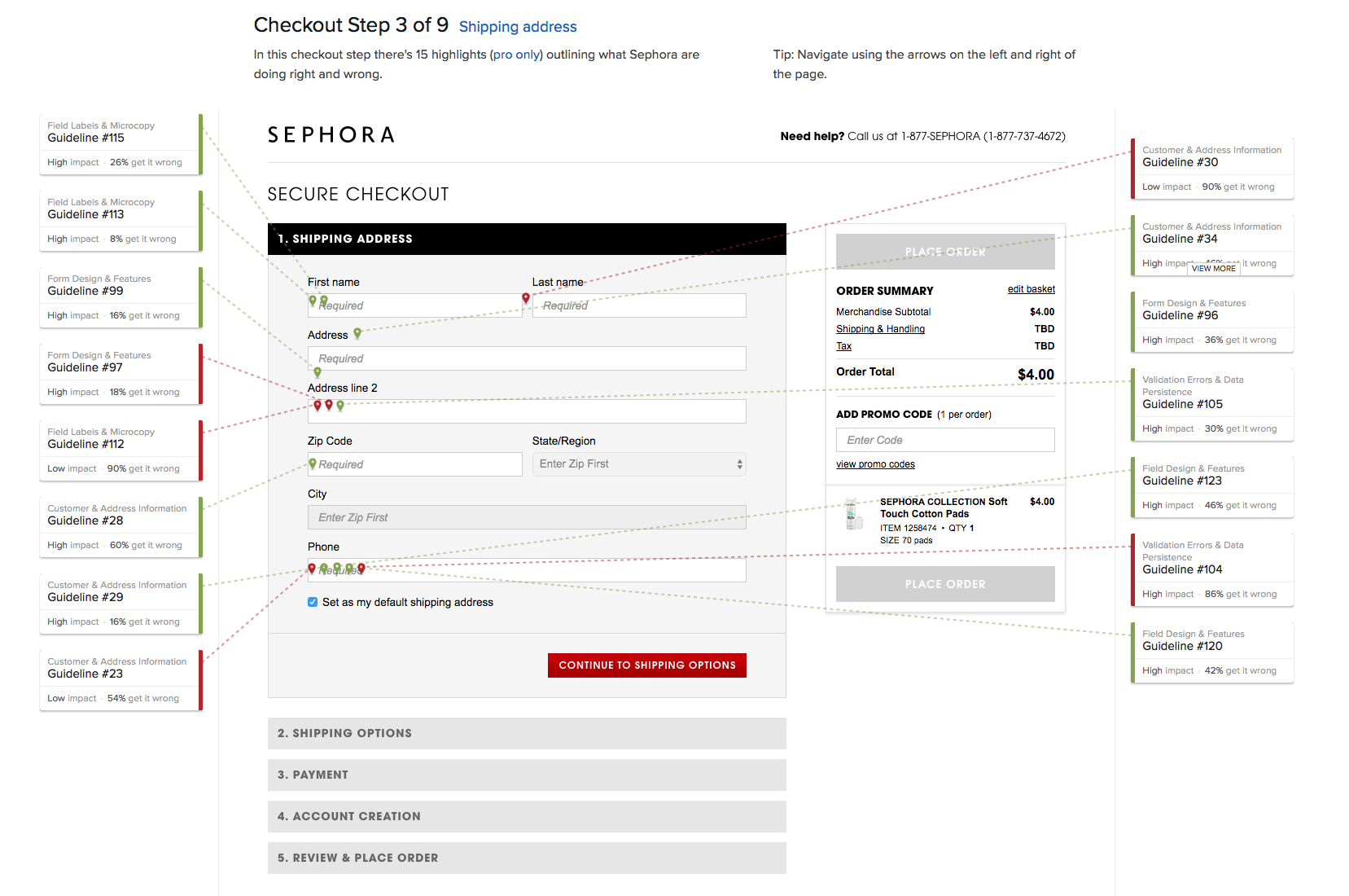
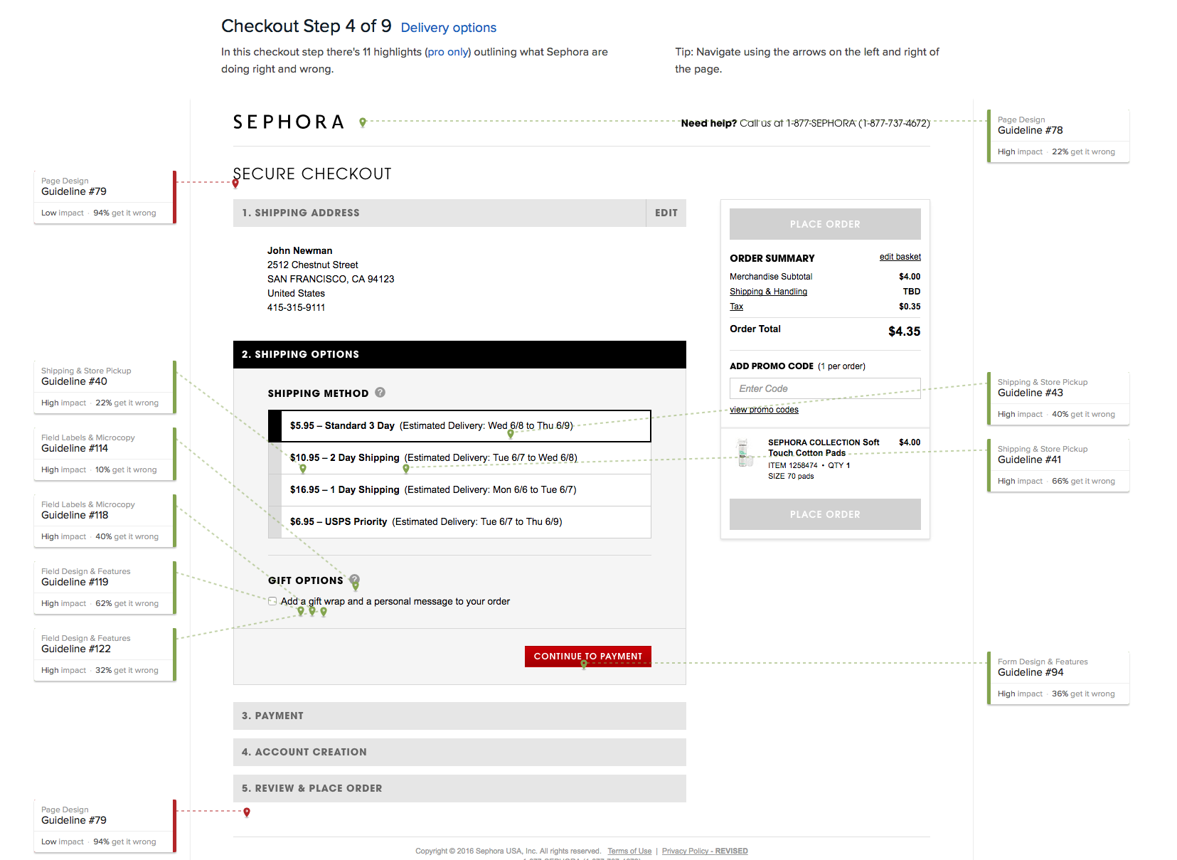
Though beauty chain Sephora is widely viewed as a disruptor when it comes to digital retailing, one place where they lagged behind other eCommerce sites was in the poorly designed, badly architected and overall confusing checkout flow.
I led the UX design team’s efforts to research user pain points, understand best practices, conduct benchmark studies of our competitors’ checkout flow, and work closely with product management to ideate and iterate on solutions.
The Results
After the redesign
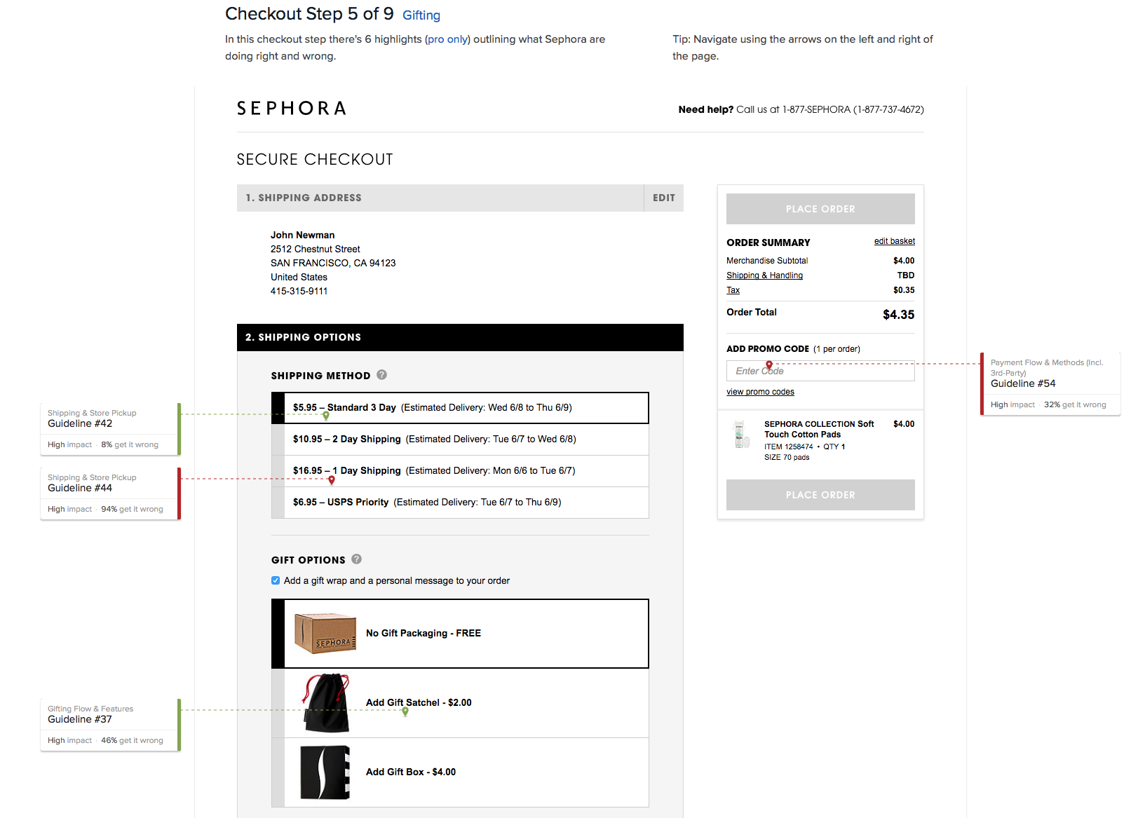
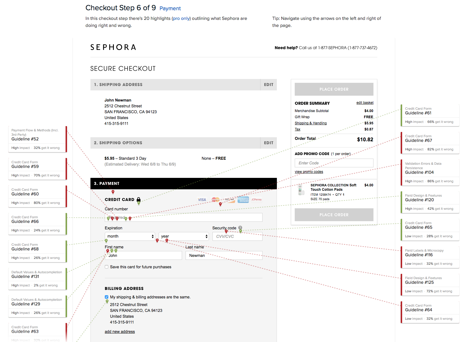
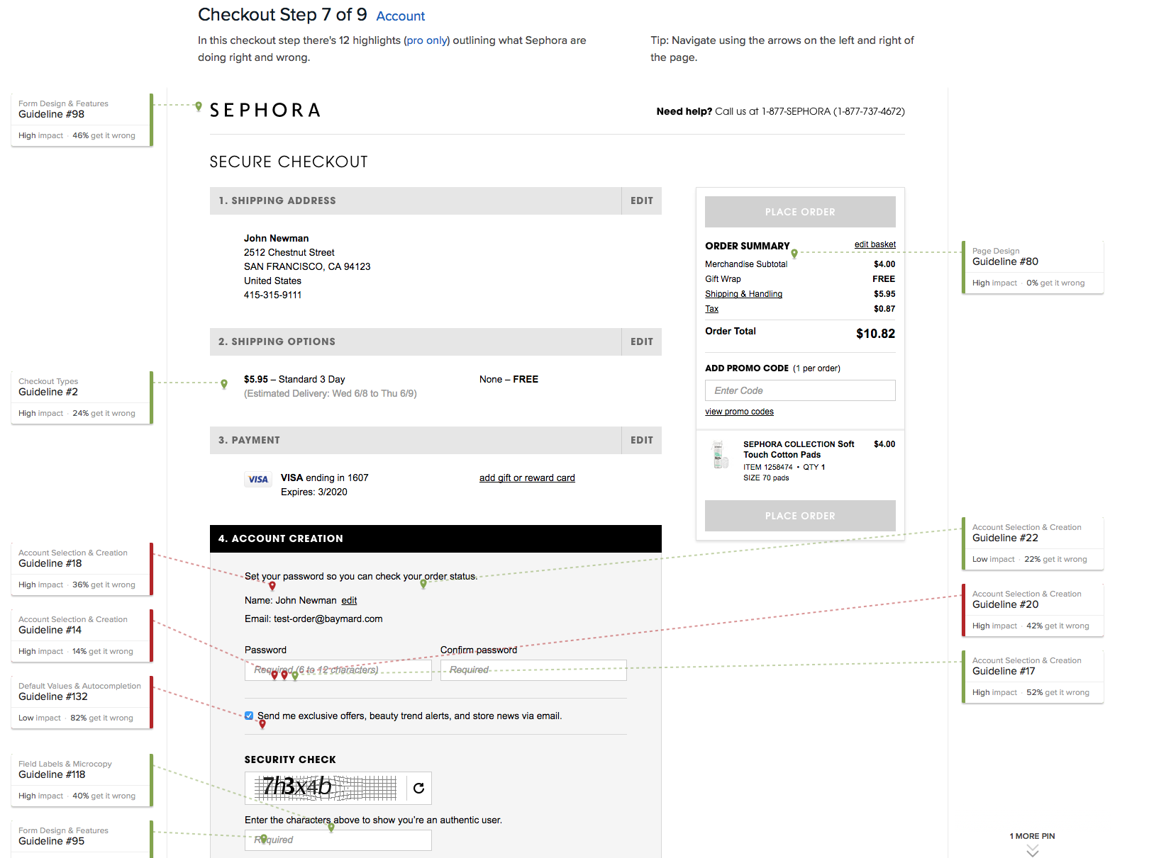
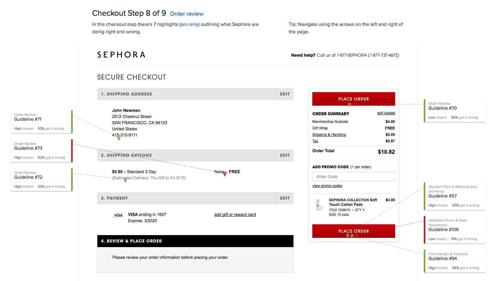
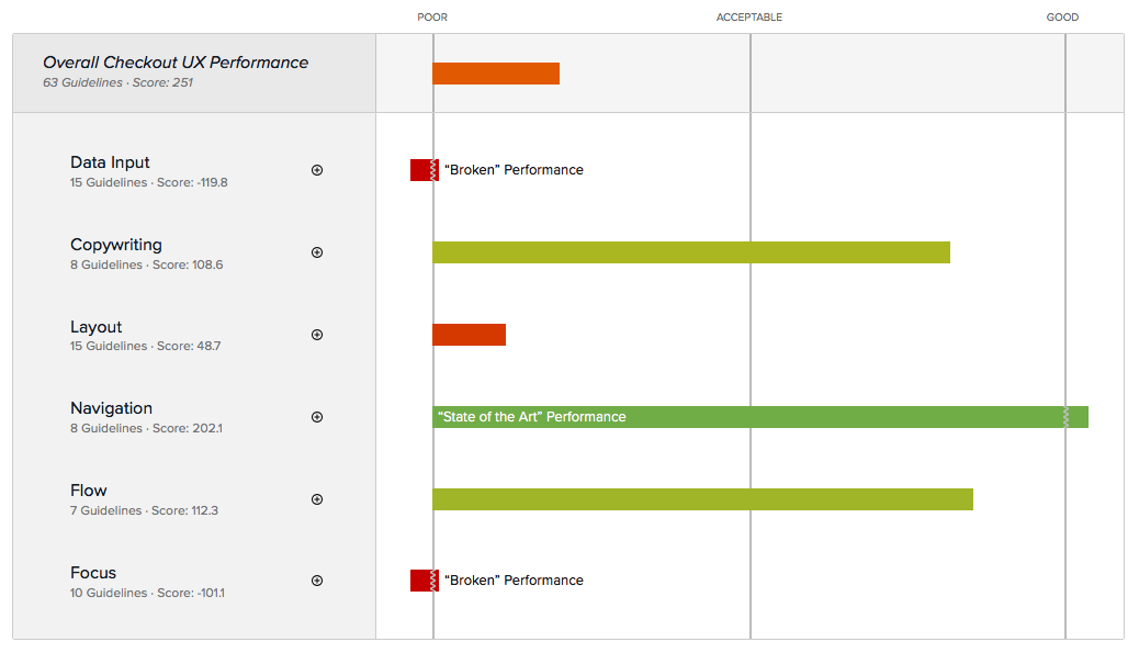
Sephora’s Checkout UX scored an overall performance of 251 on the Baymard Institute’s cart and checkout benchmark. Some of Sephora’s biggest checkout usability issues were due to
- Poor Layout
- Broken Focus
- Broken Data Input
Baymard score before redesign
Usability Testing
75 subjects | functional prototype | Think Aloud protocolGoal: to examine the full breadth of checkout behavior & present issues most likely to cause abandonment.
Benchmarking
Usability benchmark of main competitorsUsing 134 checkout usability guidelines from: Baymard usability tests, we noted areas where our flow was sub-par.
Quantitative
3 rounds of A/B testing with customersWe tested multiple billing & shipping designs, iterated on user-friendly Captachs and used Google Analytics to understand customer behavior.
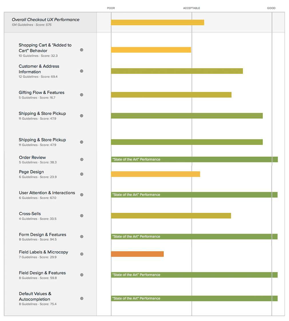
We ranked State of the Art in 5 categories:
Baymard score after redesign
Strong Process
Though it may be counterintuitive, process is the key to creative thinking. When the design team understands the stages a design will travel as it is researched, ideated, conceptualized, tested and iterated, they are free to expand their creativity within those boundaries.

Excellent Results
The results of my efforts built a team of 7 designers who handle the entirety of the Sephora digital product design. The processes ensured effective ideation through delivery to engineering. It has ensured a world-wide brand is known for it’s digital forward thinking.


