Don’t have time or money for extensive user experience testing? Follow this 10 step checklist for rock solid UX when designing your app and you’ll clear up 80% of the problems that make users tap, hold and delete your app from their mobile devices.
ONE
Priority of Uses: What are the top 3 things the user will want to do with your app? Be sure that you’ve made those 3 activities the easiest to find and complete. Think about your user’s goals and not your business goals or your advertising goals. When apps put their own (or their advertisers’) goals first, users get frustrated. An app with solid UX is just a tap away.

TWO
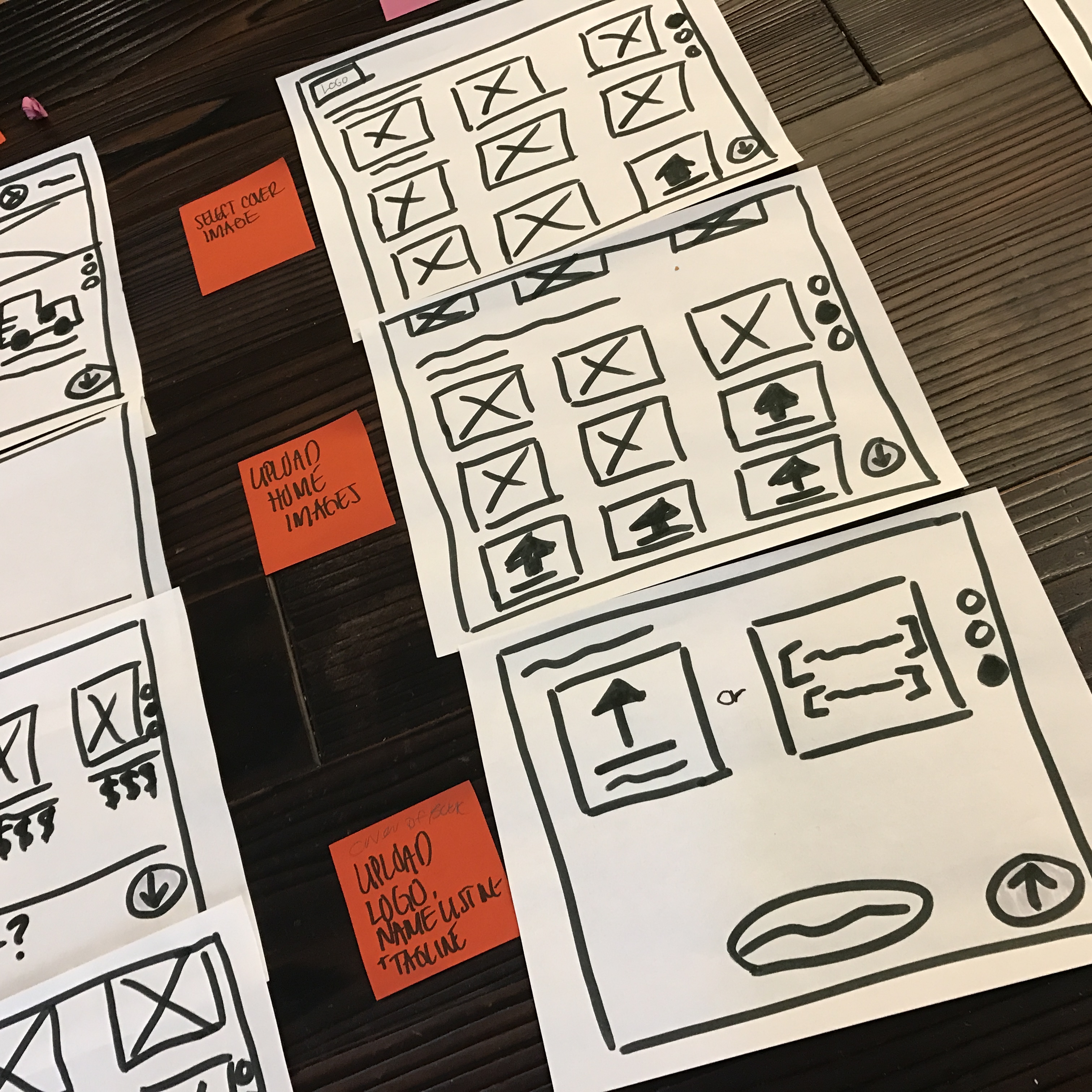
Map the User Flow: If you don’t have it already, create a flow chart that maps the entire app. Keep this up to date as you add features. This will help eliminate the endless loops and dead-ends that somehow creep into apps as more and more features are added. When your flow is too complicated, your app is too complicated, you don’t have solid UX.
THREE
Mental Model: Speaking of flow, the user will be trying to map this in their minds too. Visualizing the layout of the app helps users understand how to navigate the app. When it’s too confusing, they get lost, don’t know how to find their way back out, and quit in frustration. Can the user easily visualize your app from launch screen to detail screens?
FOUR
Visual Design: Colors, button styles and layout are not just cosmetic but part of your whole solid UX plan. They can either present a harmonious, easy to navigate app, or be jarring, misleading and confusing. Do buttons look like buttons? Do you underline text that is not a link? Are tap-able areas too close together so fat-fingering is likely? Just 3 mistaken taps can send your users running from your app, never to return (and leaving angry reviews for you).
FIVE
Real World Model: Many apps–like magazines, newspapers, and productivity apps–have real-world versions. Users will come to your app with their experiences with the real world, and they’ll expect your app to work as similarly as possible. Don’t reinvent the wheel, nobody will thank you for it. That is not solid UX.

SIX
The Mom Test: All demographics have mobile devices these days, so expect everyone from your 7-year-old to your mom to be using your app. If the app is too clever, filled with too many insider terms, or just plain non-intuitive you’ll lose 50% or more of your users in the first 5 taps. So ask your mom to try it out, and watch where she stumbles or gets confused. Those are the parts you need to fix.
SEVEN
Phone vs. Tablet: These days you should be designing for both. Designs need to be different enough to take advantage of the screen sizes, but not so different that users of one can’t easily transition to the other. Not always an easy task. Do a little cost-benefits analysis to determine which cool tablet feature really adds to the experience for users. And which just make it more complicated.
EIGHT
Cost-Benefits Analysis: As your app begins to grow its user-base, you’ll start to get pressure to add features. Now is the time to be very careful about what gets added to the feature list, and what does not. Assess the benefit to the user that a new feature brings, and what the cost. Over-complicating the navigation just to add a cool feature that a handful of users might use, is not a good benefit for the cost.
NINE
New Users vs. Expert Users: Your app needs to be easy for first time users to pick up and use immediately. And it must fit the needs of those who have been using it for months or years. This never mean writing a user handbook! Think about what a user sees upon opening the app for the very first time. Do you provide hints, an over-view, instructions for use? Great! But after the first time, put the hints behind a button. A quick-guide should always a tap away, but never in the way of the expert user.
TEN
Simple is always better: No matter the temptation, a simple navigation will always be more successful at keeping and growing your user base. Resist the temptation to have clever menus hidden behind multiple tabs and buttons. Put navigation where the user expects it to be. Don’t over-think the design. Form must always follow function.